


For quite some time now I have been working on my portfolio website www.josemukorivo.com. The portfolio I was using before this one was developed back in 2018 when I was doing my internship. Recently I felt it was outdated, in fact the site was never updated after the launch.
Old website hero section
Overview
I like to think of a portfolio as a developer playground so sometimes you can even see a portfolio that is running on kubernetes with 10 replicas 😃 simply because the developer wanted to test out some cool kubernetes features. My point here is that the stack I choose may be an overkill for a portfolio, but hey why not😎?
This post is also available as a video here
Design
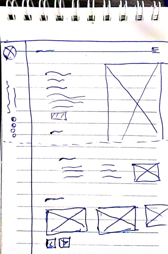
Before I started developing the portfolio I started by creating wireframes of what I wanted my portfolio to look like. I created these wireframes using a pen and a small book. Below is a sample wireframe for the portfolio.
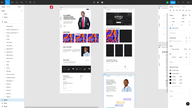
After designing the wireframes I headed over to figma for the actual design I used for development. Please note that not everything on the portfolio was designed in figma some things were added during development, there are also some things that were designed on figma that were not coded because I changed the design. Below is how the first iteration of the design looked like in figma.
Content
The next thing after the design was generating content for the website. For me that was one of the difficult stages but luckily I didn't want too much content. Can you believe that GitHub Copilot helped me out with some of the content 🤔, I mean the AI is that good👌🏼.
Development
After designing and generating content I started the development of the portfolio. Before I go into the details let me give you a list of some of the things powering the portfolio.
- React for the UI
- NextJS for SSG/SSR/ISSG
- Tailwind css for styling
- CSS modules styling without class name collision
- Dev.to API
- Mailchimp
- Vercel
- GitHub
- Framer motion
- TypeScript
Development was the most interesting stage so I am probably going to spent slightly more time here. At the core of this portfolio there is ReactJS. I used React to create all the components. Below is a sample reusable Button component and its styles.
Button.tsx
import {
  FC,
  forwardRef,
  useRef,
  ButtonHTMLAttributes,
  JSXElementConstructor,
} from 'react';
import Link from 'next/link';
import cn from 'classnames';

import s from './Button.module.scss';
import { mergeRefs } from '@utils/index';

interface ButtonProps extends ButtonHTMLAttributes<HTMLButtonElement> {
  href?: string;
  className?: string;
  disabled?: boolean;
  loading?: boolean;
  target?: '_blank' | '_self' | '_parent' | '_top';
  size?: 'sm' | 'md' | 'lg';
  type?: 'button' | 'submit' | 'reset';
  variant?: 'primary' | 'secondary' | 'naked';
  as?: 'button' | 'a' | JSXElementConstructor<any>;
}

export const Button: FC<ButtonProps> = forwardRef((props, buttonRef) => {
  const {
    as: Tag = 'button',
    variant = 'naked',
    size = 'md',
    type = 'button',
    target = '_self',
    href,
    className,
    disabled,
    children,
    ...rest
  } = props;
  const ref = useRef<typeof Tag>(null);
  const classes = cn(
    s.root,
    {
      [s.primary]: variant === 'primary',
      [s.secondary]: variant === 'secondary',
      [s.naked]: variant === 'naked',
      [s.sm]: size === 'sm',
      [s.md]: size === 'md',
      [s.lg]: size === 'lg',
      [s.disabled]: disabled,
    },
    className
  );

  return (
    <>
      {href ? (
        <Tag ref={mergeRefs([ref, buttonRef])} {...rest}>
          <Link href={href}>
            <a className={classes} target={target}>
              {children}
            </a>
          </Link>
        </Tag>
      ) : (
        <Tag
          ref={mergeRefs([ref, buttonRef])}
          disabled={disabled}
          className={classes}
          {...rest}
        >
          {children}
        </Tag>
      )}
    </>
  );
});

Button.displayName = 'Button';
Button.module.scss
.root {
  @apply mb-1 inline-block transition duration-200 ease-linear;
}

.primary {
  @apply bg-rose-500 text-white ring-rose-500 ring-offset-2 hover:bg-rose-600 hover:ring dark:ring-offset-slate-900 2xl:ring-offset-4;
}

.secondary {
  @apply bg-slate-800 text-white ring-slate-800 ring-offset-2 hover:bg-slate-900 hover:ring dark:bg-slate-700 dark:ring-slate-700 dark:ring-offset-slate-900 2xl:ring-offset-4;
}

.naked {
  @apply bg-white text-slate-900;
}

.md {
  @apply px-6 py-2;
}

.lg {
  @apply px-7 py-4 text-sm md:px-8;
}

.disabled {
  @apply cursor-not-allowed opacity-30;
}
The components were code using TypeScript for type safety. TypeScript also helps you with writing code that is self documenting. For styling I used tailwindcss but note that classes in react components are clean because the tailwind utility classes are in a separate css file which is a CSS module. CSS modules helps in avoiding namespace collision for CSS classes. Below will be how the Button can be used.
<Button
   variant='primary'
   size='lg'
   href='/blog'
   className='uppercase'
  >
   Read my blog
</Button>
Almost all of my reusable components are coded this way.
These small components like the Button, Text, Link and Box are located in the components/ui/ folder and exported using using a single index.ts file so that they can be imported like so
import { Text, Box, Container, Link, Button } from '@components/ui';
Sections like the hero section are located in the components/sections/ folder and common elements like the Navigation and Footer are in the components/common/ folder.
Dark mode
This portfolio has both a light and a dark mode, this was made simple by the dark mode support of tailwind. When you first visit the site I check if you have dark mode enabled in your system preferences, if so you get the site in dark otherwise you get it in light mode. There is also a button that allows you to switch between dark and light mode. I even created a custom hook for toggling the theme let me show you the code for that.
useTheme hook
import { useEffect, useState } from 'react';

export const useTheme = () => {
  const getTheme = (): 'light' | 'dark' => {
    // Check user preference for theme first
    if (
      window.localStorage.theme === 'dark' ||
      (!('theme' in window.localStorage) &&
        window.matchMedia('(prefers-color-scheme: dark)').matches)
    ) {
      return 'dark';
    } else {
      return 'light';
    }
  };

  const [theme, setTheme] = useState('');

  const toggleTheme = () => {
    if (theme === 'light') {
      setTheme('dark');
      window.localStorage.setItem('theme', 'dark');
    } else {
      setTheme('light');
      window.localStorage.setItem('theme', 'light');
    }
  };

  useEffect(() => {
    setTheme(getTheme());
    if (theme === 'dark') {
      document.documentElement.classList.add('dark');
    } else {
      document.documentElement.classList.remove('dark');
    }
  }, [theme]);

  return { theme, toggleTheme };
};
Example Usage
import { BiSun, BiMoon } from 'react-icons/bi';
import { useTheme } from 'hooks';

export const Example = () => {

const { theme, toggleTheme } = useTheme();

  return (
    <Box>
     <Button onClick={toggleTheme}>
       {theme === 'dark' ? (
          <BiSun className='h-4 w-auto' />
        ) : (
          <BiMoon className='h-4 w-auto' />
        )}
        {theme === 'dark' ? 'Switch to light mode' : 'Switch to dark mode'}
     </Button>
    </Box>
  );
};
SEO
Even though this was a simple portfolio website I had to make sure that it is search engine friendly. I created a Page component that takes some SEO data as props and every page on the site uses it as a parent.
Page.tsx
import { FC } from 'react';
import Head from 'next/head';

interface Props {
  title: string;
  description: string;
  image: string;
  canonicalURL?: string;
}

export const Page: FC<Props> = ({
  children,
  title,
  description,
  image,
  canonicalURL,
}) => {
  return (
    <>
      <Head>
        <title>{title}</title>
        <meta name='description' content={description} />
        <meta
          name='keywords'
          content='Joseph, Mukorivo, Joseph Mukorivo, software engineer, Harare, Zimbabwe, Harare software developer, zimbabwe developer blog, software development blog, DevOps blog, Cloud Computing blog, React Developer, React Blog'
        />
        <meta name='author' content='Joseph Mukorivo' />
        <meta name='image' content={image} />
        <meta name='og:title' content={title} />
        <meta name='og:description' content={description} />
        <meta name='og:image' content={image} />
        <meta name='og:url' content='https://josemukorivo.com' />
        <meta name='og:site_name' content='Joseph Mukorivo' />
        <meta name='og:type' content='website' />
        <meta name='twitter:card' content='summary_large_image' />
        <meta name='twitter:title' content={title} />
        <meta name='twitter:alt' content={title} />
        <meta name='twitter:description' content={description} />
        <meta name='twitter:image' content={image} />
        <meta name='theme-color' content='#f43f5e' />
        <meta name='twitter:site' content='@josemukorivo' />
        <meta name='twitter:creator' content='@josemukorivo' />
        {canonicalURL && <link rel='canonical' href={canonicalURL} />}
      </Head>
      <main>{children}</main>
    </>
  );
};
Example Page usage
import { About, Hero, LatestBlogs, TechStack } from '@components/sections';
import { Footer, Nav, Page } from '@components/common';

export default function Home({ articles }) {
  return (
    <Page
      title='Joseph Mukorivo | Software Engineer'
      description='Joseph Mukorivo is a Software Engineer, Blogger and DevOps Enthusiat based in Harare, Zimbabwe.'
      image='https://josemukorivo.com/images/me.jpeg'
    >
      <Nav className='absolute py-3 md:py-5' />
      <Hero />
      <About />
      <LatestBlogs articles={articles} />
      <TechStack />
      <Footer />
    </Page>
  );
}
I also used other tools like Google Analytics, Google My Business and Google search console for SEO. Right now a simple google search of my name Joseph Mukorivo gives the user more information about me.
I also used some open graph tags to make sure that the site has some nice priviews when I share it on social media.
Blogs
My blogs are coming straight from the dev.to api and I am using NextJS to build pages with blog content at build time like so. More on NextJS can be found here
export async function getStaticProps() {
  const res = await fetch(
   `https://dev.to/api/articles?username=${DEV_TO_USERNAME}&per_page=5`
  );
  const articles = await res.json();

  return {
    props: {
      articles,
    },
    revalidate: 60,
  };
}
Cool Feature
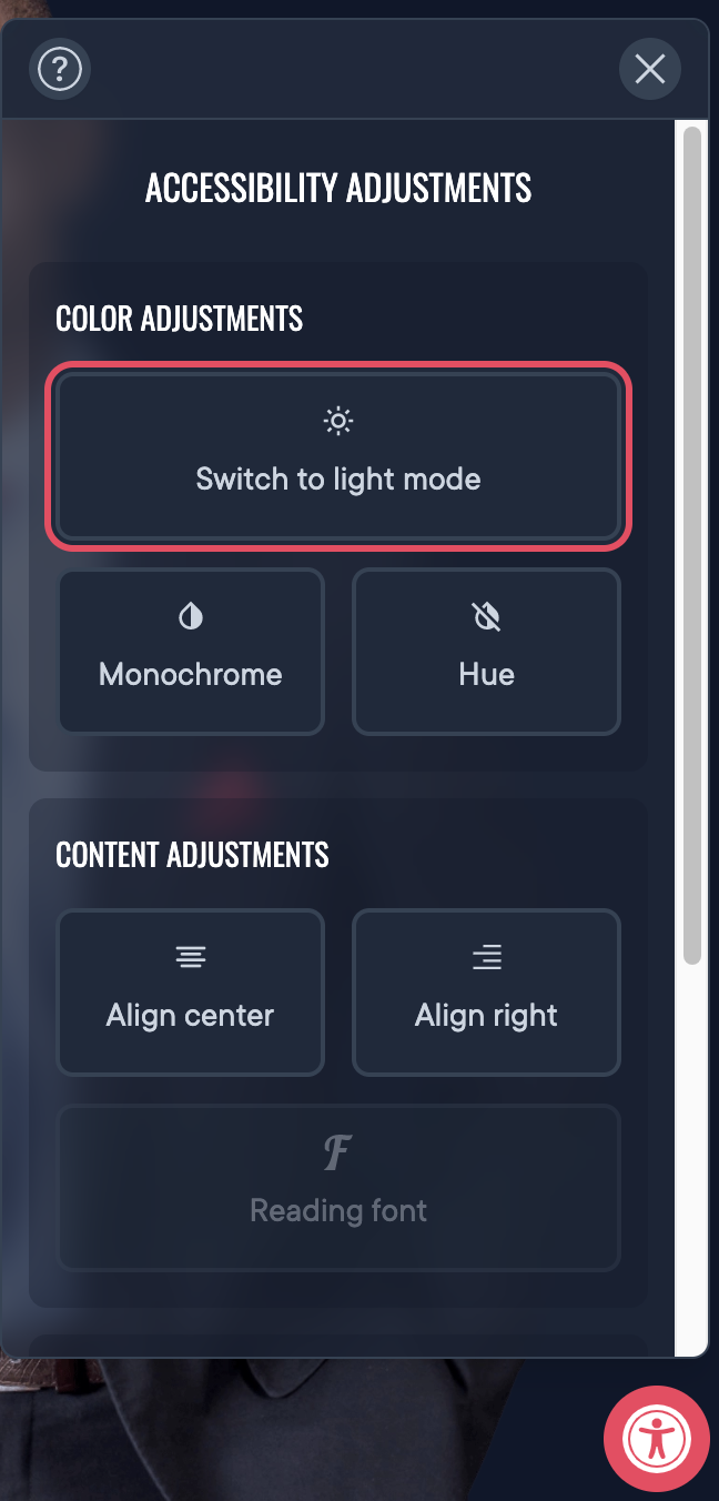
I added a widget for customising the website. That is what the user uses to toggle between light and dark mode, they can also use it to to turn the website into black and white, apply the hue filter or change text alignment which might be useful for people who read from right to left. This widget is still under development once I get other features to work I am going to open source it as a separate component. The idea for this widget came from a friend of mine.
Mailing list
I am also running a mailing list where I will be sharing some tips about web development and some cloud technologies. Will be glad if you subscribe😎. The mailing list is run using mailchimp.
Hosting
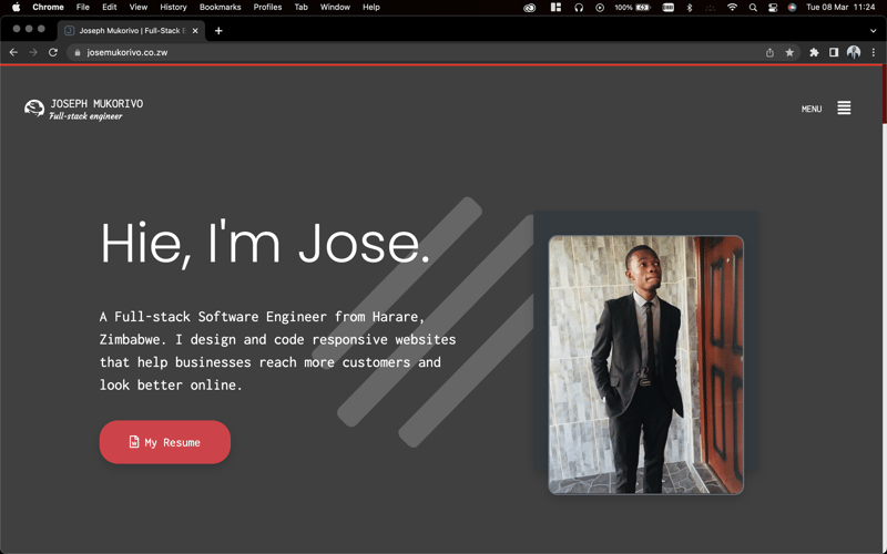
This portfolio is hosted on Vercel and it rebuilds every time I push to the main branch on github.
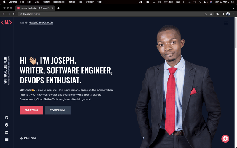
Final site hero section in dark mode
Repository
I have open sourced my portfolio so that other people can learn from it and also help to improve. You are free to fork and star the repo and always welcome to submit a pull request with improvements and other cool features😎.
Here is the link to the repository
Please
Do not copy the code and host it without modifications, I spent some time doing this project would love it to be unique. Make sure you change the design and other things so that it doesn't look exactly like mine and crediting me by linking back to www.josemukorivo.com is always appreciated.
I hope this article helped you with something. You can follow me on twitter or subscribe to my mailing list to get some information on what I am working on.
You may love these ones


Create a highly reusable button with styled-system and styled-components.
Create a highly reusable button with styled-system and styled-components.

Can One Person Really Build a Complex System from Scratch?
Can One Person Really Build a Complex System from Scratch?
Copyright © 2025 | All rights reserved.
Made with ❤️ in Zimbabwe🇿🇼 by Joseph Mukorivo.